
Supply and Demand Graph Template
Determine the right price points for your products and services easily and efficiently.
About the Supply and Demand Graph Template
Miro’s supply and demand graph template is a ready-to-use diagram designed to help you price your products strategically. By seeing where market demand meets supply, you’ll be better equipped to pinpoint the sweet spot for your prices — affordable enough for your customers and profitable for your business.
We’ll walk you through how to make the most of the supply and demand graph template and point out the unique benefits that come with filling it out in Miro.
How to use Miro’s supply and demand graph template
Ready to use the supply and demand graph template? Get started by clicking on the blue “Use template” button on the page to open the template up in Miro. Once you’re in, follow the steps below:
1. Gather the data
You’ll need data to populate the supply and demand graph template, so pull up a spreadsheet. In Miro, you can easily embed your spreadsheets right on your board — allowing you to fill the template in without having to go back and forth to get data. Just head to the toolbar, click “More apps,” look for “Upload,” and choose how you’d like to import your spreadsheet.
2. Edit the axes
The template comes with a pre-made X-axis representing the product quantity and a Y-axis representing the price per unit. Take a look at the values and measurement units along the axes and edit them if needed. For example, if you’re measuring your prices in the Euro (EUR), double-click on the ‘$’ symbol to replace it with a ‘€’ symbol.
3. Adjust the curves
Click and drag the pre-made supply and demand curves to adjust their position on the diagram based on your data — making sure both curves intersect at some point.
To lengthen a curve, click on it once to reveal the two white dots on each end, then click and drag either dot until the line is as long or short as you want it to be. You can use the blue dot in the middle of the line to adjust the arch of the curve.
4. Mark the equilibrium point
See where the curves intersect on the diagram? You’ll need to mark that as the equilibrium point by drawing lines from the two axes toward it. Luckily, the supply and demand graph template already comes with a few lines like these, so all you’ll have to do is adjust their lengths and positions on the diagram.
5. Customize the template
Your supply and demand diagram should be easy and inviting to read, so feel free to customize its look and feel. Try changing text colors, font types, or line styles and thickness. You can even add sticky notes to include important context about the supply and demand diagram — just press N on your keyboard.
Taking the time to customize the template can be especially helpful if you’ll be sharing it with senior stakeholders and need to keep up with brand guidelines.
Benefits of using Miro’s supply and demand graph template
Accessing Miro’s supply and demand graph template doesn’t just save you time from having to build a diagram from scratch but also grants you access to our visual workspace for innovation — packed with intuitive diagramming tools and next-level collaboration features.
Easily collaborate on the template with teammates by inviting them to edit your Miro board with you in real time — even if you aren’t in the same room. Prefer to work async? Share your board when you’re ready and have others view and comment on your diagram, and keep each other in the loop by tagging the right people.
Need to present your supply and demand diagram to others? Use Presentation Mode to run live and engaging sessions right from your Miro board, complete with interactive features to maximize participation. Not up for another meeting? Use TalkTrack to record immersive audio and video walkthroughs and share these as interactive sessions people can watch in their own time.
Last but not least, you’ll want to keep your template up to date as market conditions change. With a supply and demand graph maker like Miro, it’s easy to make changes and keep everyone informed in real time — making sure everyone on the Miro board has the same source of truth at all times.
Is Miro’s supply and demand graph template free?
Yes, the supply and demand graph template is free and fully customizable. Just click on the “Use template” button to create a free account and open the template in Miro.
Why create a supply and demand diagram?
Understanding supply and demand is helpful for determining the prices and quantities of goods and services on the market. More specifically, it helps businesses understand what their customers want — allowing them to set their products and services at reasonable price yet profitable prices.
How can I share my supply and demand diagram with others?
Absolutely. When you’re done filling in the supply and demand graph template, you can choose from multiple ways to share it. Export it as a PDF or image by heading to the “Main menu” at the top of your Miro board, clicking “Export” and choosing a file format. You can also generate a shareable link or an embed code. Alternatively, invite others to view and comment on your Miro board, allowing you to get instant feedback and make any necessary changes — all in one place.
Get started with this template right now.

Affinity Diagram Template
Works best for:
Desk Research, Mapping, Product Management
You can use an affinity diagram to generate, organize, and consolidate information that comes out of a brainstorming session. Whether you’re building a product, working through a complex problem, establishing a process, or piecing apart an issue, an affinity diagram is a useful and simple framework that gives each team member the opportunity to pitch in and share their thoughts. But it’s not just ideal for brainstorms—this is a great template and tool when you need to reach consensus or analyze data such as survey results.

Ansoff Matrix Template
Works best for:
Leadership, Operations, Strategic Planning
Keep growing. Keep scaling. Keep finding those new opportunities in new markets—and creative new ways to reach customers there. Sound like your approach? Then this template might be a great fit. An Ansoff Matrix (aka, a product or market expansion grid) is broken into four potential growth strategies: Market Penetration, Market Development, Product Development, and Diversification. When you go through each section with your team, you’ll get a clear view of your options going forward and the potential risks and rewards of each.
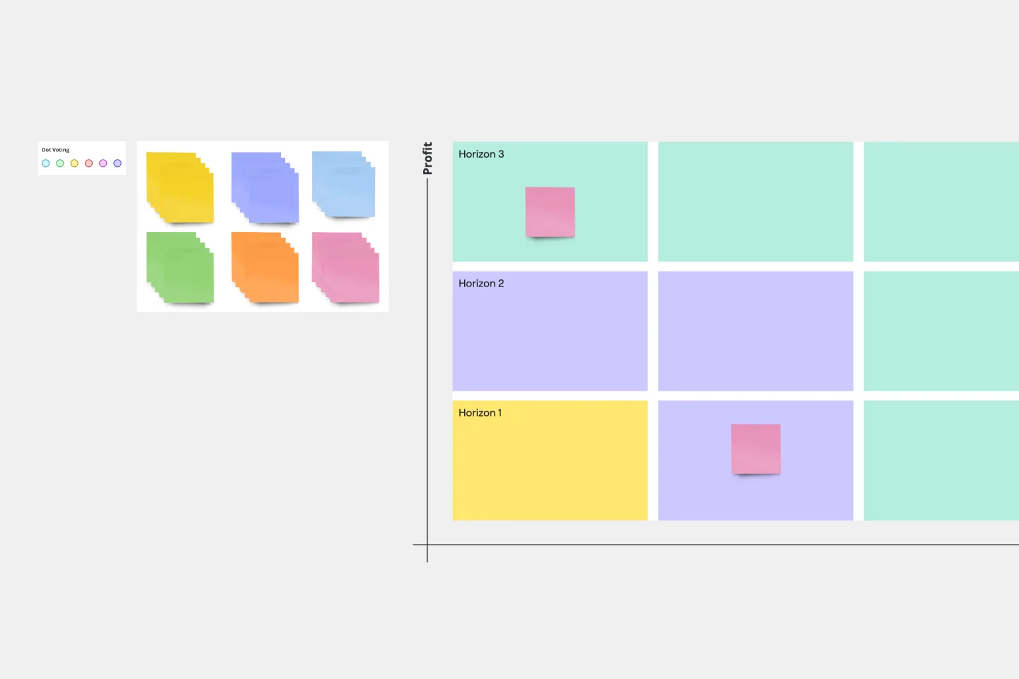
3 Horizons of Growth Template
Works best for:
Leadership, Strategic Planning, Project Planning
Featured in The Alchemy of Growth, this model gives ambitious companies a way to balance the present and the future—in other words, what’s working in the existing business and what emerging, possibly-profitable growth opportunities lie ahead. Then teams across the organization can make sure that their projects map to and support the organization’s goals. The 3 Horizons of Growth model is also a powerful way to foster a culture of innovation—one that values and depends on experimentation and iteration—and to identify opportunities for new business.