
Bar Graph Template
Compare different types of categories and datasets visually.
About the Bar Graph Template
A Bar Graph Template shows data in categories, illustrated with rectangular bars with different lengths, plotted vertically or horizontally. It’s a great way to make your presentations and reports more engaging and easier to read.
What is the Bar Graph Template?
The Bar Graph Template compares data in different categories, and it consists of rectangular bars that are either placed vertically or horizontally. This kind of graph is ideal for comparing or showing trends of multiple data sets.
When to use a Bar Graph Template
Bar graphs -- also commonly called bar charts -- are a handy way to compare different datasets or track trends over time. Another way of using the bar graph is to simply compare data against one another.
Many professionals from all industries use bar charts and make graphs to support their storytelling and enhance understanding while presenting data. It’s one of the easiest and quickest ways to show data comparison visually.
How to create a bar graph with Miro
You can easily make a bar graph in Miro, using our ready-made template or drawing one from scratch. Miro’s extensive diagramming capabilities are the perfect bar graph maker, allowing anyone to easily create and share a bar chart.
How to make a bar graph using our ready-made template:
Select the Bar Graph Template
Double-click the bar graph and add data to each series. Make sure to add real numbers and not percentages.
Edit the title, legend, and description.
After you set your bar graph, you can edit how it looks and change the colors as you like.
How to make a bar graph from scratch:
Click ‘charts’ on the toolbar.
Select the object, in this case, the bar graph.
Double-click the bar graph. A pop-up window will show.
Add your data.
In Miro, you can edit the values of your bar graph, and the colors will be selected automatically.
A simple bar graph example
Imagine that you are analyzing which movies had the biggest attendance in one given cinema. In the x-axis of your bar graph (horizontal), you can add each movie. On the y- axis you can add the number of people who have been to the cinema (vertical axis).
After you count how many people attended each movie, you can see in your bar graph which movie was the most attended at a glance.
How do you create a bar graph?
Bar graphs consist of rectangles plotted vertically or horizontally. In the horizontal axis, add the time frame or the categories or names of the things you want to analyze, and in the vertical axis, you can add the quantities that will be measured. You can also switch the axes, so you have either a vertical or horizontal bar graph. Miro is the perfect bar graph maker, with extensive diagramming capabilities that are easy to use and share with your team. Try it out and see if that works for you.
Get started with this template right now.

Alignment Chart Template
Works best for:
Desk Research, Brainstorming, Team Meetings
The alignment chart originated in the Dungeons & Dragons (D&D) fantasy role-playing game to allow players to categorize their characters according to their ethical and moral perspectives. Since then, people around the world have begun to use the alignment chart as a fun way to describe their own characteristics and personas, as well as fictional characters, famous people, and much more. In the conventional set-up, you figure out your placement in the alignment chart based on your views on law, chaoss, good, and evil. But you can adapt the alignment chart to reflect any characteristics you wish to use to create personas.
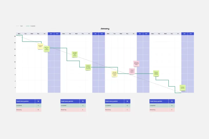
Burndown Chart Template
Works best for:
Project Management, Agile Workflows, Mapping
Whoa whoa whoa, pace yourself! That means knowing how much work is left—and, based on the delivery date, how much time you’ll have for each task. Perfect for project managers, Burndown Charts create a clear visualization of a team’s remaining work to help get it done on time and on budget. These charts have other big benefits, too. They encourage transparency and help individual team members be aware of their work pace so they can adjust or maintain it.

Business Organizational Chart Template
Works best for:
Leadership, Org Charts, Operations
Establishing hierarchy in a business can empower employees—to know their roles and responsibilities, team members, potential cross-functional collaborators, and who to turn to with a specific need. That’s just what a Business Organizational Chart does. And this template makes it simple to build a BOC for your company. The first step is to determine the high-level organizational structure of your company. Then it's easy to create a visual representation of how different employees are interconnected.